Sanctuary Recruitment Website Analysis
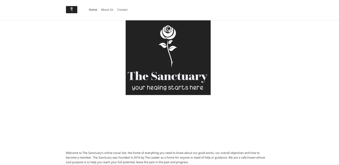
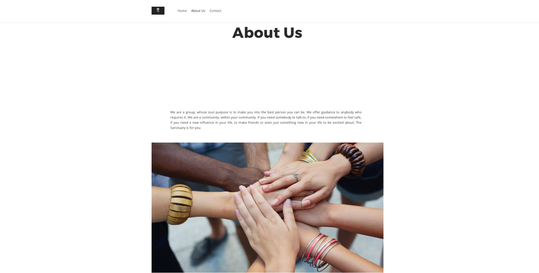
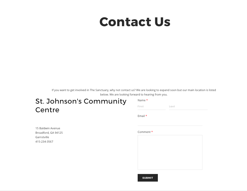
For our trailer, we wanted to incorporate a technological element in order to bring our film into a more 21st century market. We decided our cult should use a website as as method of awareness and recruitment. Our group chose to create a website that is simple to use and not too extravagant as 'The Sanctuary' wanted to appear humble and grow as the film progresses. The white colour scheme is representing the Cult's outward portrayal of a pure organisation who only wishes to help people. It's simplistic design was key in the early thought process of our idea. The intention is for 'The Sanctuary' to appear as innocent as possible before delving into their true dark motive. As shown below, you can see the home page, featuring the logo and an about us section which explains the group;s background. Our group chose to include a contact page where you can get in touch with 'The Sanctuary' and learn how you can get involved in the group.
If you want to visit the actual website it is still left up today :
http://thesanctuarysocial.weebly.com/
If you want to visit the actual website it is still left up today :
http://thesanctuarysocial.weebly.com/
Click to set custom HTML