Logo Ananlysis
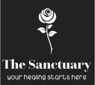
Our teams goal with 'The Sanctuary' logo was that it was simple and seemingly innocent. The use of the colours black and white were carefully thought out to represent "The Sanctuary('s)" no nonsense 'black and white' policy.
|
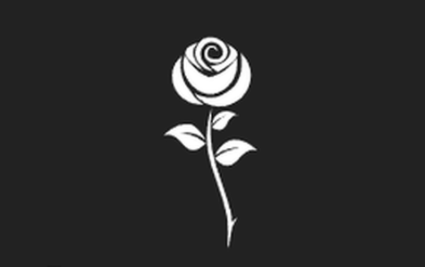
The use of the single white rose as our symbol is intended to be peaceful and innocent however the singular thorn at the root of the plant is there for our more niche viewers who we hope will understand that the thorn foreshadows the upcoming violence and hurt. |

|
Our slogan 'your healing starts here' is both a reference to the emotional healing the group claims it can do and the 'healing' the group believes it is doing in terms of brainwashing it's members. |
Inspiration

|
|

|
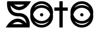
We used several different logos for our inspiration. The first logo was our main inspiration because we liked how clear and simple it was. The second logo inspired us because of the use of symbolism. Finally the 'Jaguar' logo inspired us because even without the brand name titled below it, is is still recognisable. Our goal was for the 'Sanctuary' logo to be simple, clear and effective. It needed to represent exactly what it stood for and that is what we feel like we have achieved.
