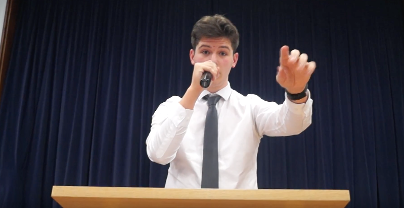
In what ways does your media product use, develop or challenge forms and conventions of real media products?
Our media trailer both uses, develops on and presents a challenge to the forms and conventions of real media products. 'The Sanctuary' does not really conform to any recognised sub-genre of horror but we wanted to convey the 'scary' nature of the film. The easiest way for us to do this was create and then conform to a criteria that we felt was standard for most horror trailers. 'The Sanctuary' is unique and we definitely wanted to present this by challenging some of the 'horror trailer' stereotypes.
THE TRAILER
Following Codes and ConventionsWe learnt during our research phase that there was almost an 'ingredients list' for a successful horror trailer. This list includes the stereotypical forms and conventions such as;
|
|
|
OMINOUS AND CREEPY MUSIC
Our group decided to use ominous and creepy music in our trailer to signal from the start it was going to be a horror film. We found the the cover of 'Everybody Wants to Rule the World' by Lorde related to 'The Sanctuary' because of the nature of the lyrics. The original version of this song is so high pitched and fast paced in comparison that this version of the song should unsettle viewers of captivate their attention further. |
|
|
DARK AND LOW LIGHTING
Through our research we found a typical convention of horror trailers and films is the use of dark and low lighting. Dark and low lighting is typically used in horror trailers to build suspense and anticipation. This was a convention that we felt was really important to include in contrast to the light and well lit shots in the beginning of our trailer. |
|
THE KILLER
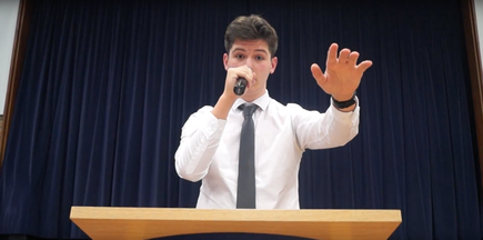
Our group chose to follow the traditional convention of having a male killer. This was largely due to the storyline being heavily male focused as well as casting choices. We found through out research that audiences needed a main character they could relate to and Joseph (Alpha) was perfect for that role.
Our group chose to follow the traditional convention of having a male killer. This was largely due to the storyline being heavily male focused as well as casting choices. We found through out research that audiences needed a main character they could relate to and Joseph (Alpha) was perfect for that role.
|
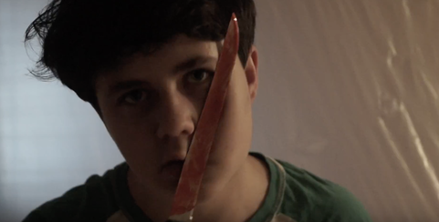
THE WEAPON
In our trailer we followed the typical convention of having the male killer use a standard kitchen knife as one of his weapons. In many iconic horror films such as Scream, Halloween and Psycho, a similar knife is used as it is perfect to create a bloody scene and gives a chance for the killer to get up close and personal with the victim. We thought it was a weapon we couldn't leave out of our trailer as it is such an iconic weapon of choice. |
|
Challenging Forms and ConventionsChallenging the accepted forms and conventions of a 'typical' horror trailer was really important to our group. 'The Sanctuary' is not a typical horror and does not conform to one specific sub genre. Instead, 'The Sanctuary' it incorporates many different horror concepts and we wanted to reflect the unique nature of the film in our trailer. To do this we excluded some of the 'typical' conventions in favour of developing our own.
|
|
|
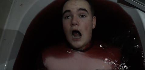
FINAL GIRL THEORY (OR NOT)
Our trailer does not feature a 'Final Girl' and neither would the film. We decided to challenge this convention and instead present the view that males can be victims of cults too. |
|
|
THE PROMOTIONAL FILM
As part of our trailer we chose to incorporate 'The Sanctuary's' promotional film used in the film to recruit members. This challenges convention as it does more than promoting the film by also promoting the business and provides an interesting twist. |
|
|
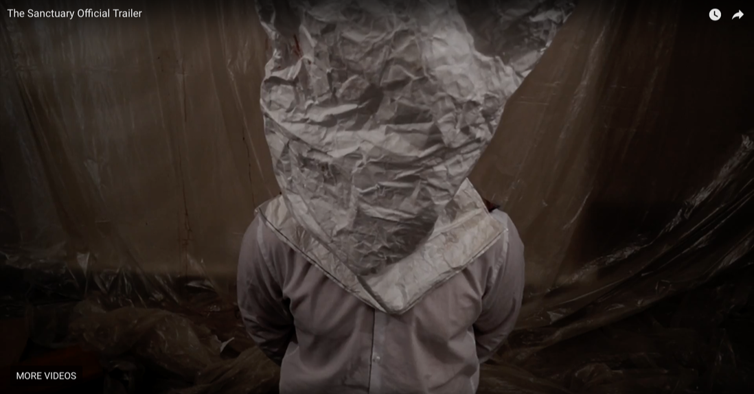
THE KILLER IS REVEALED
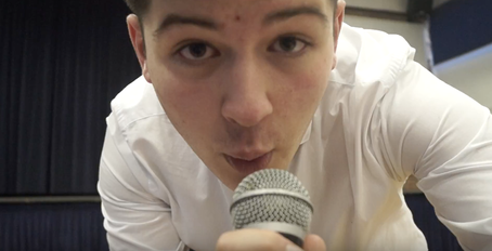
We chose to reveal our antagonist/killer early in the trailer as we wanted our film to have a documentary feel to it. Challenging convention by revealing the killer early on is a risk; some audience members prefer mystery. However we felt this risk was worth it as 'The Sanctuary's more about motive and what they did rather than the killer. |
|
THE POSTER
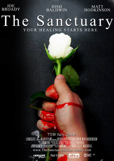
Our poster included several codes and conventions which can be found across various other examples. Other than having a figure in the centre of our poster, we included a hand holding The Sanctuary's signature flower, the white rose. The rose also features in the groups logo, which can be found in our trailer and on the official website of the film(www.thesanctuarysocial.weebly.com). This cross media convergence allows our logo to appear on multiple platforms, creating synergy. The juxtaposed image of the white rose and bloodied hand challenges convention; it gives another horror dimension to ‘The Sanctuary’. The black background represents the evil and the white rose represents the purity The Sanctuary hides behind. The vice grip around the rose shows the control the group have on the group, highlighted by the deep red blood running down the hand. The poster also challenges convention by having the title in lower case instead of capitals. We used the rule of thirds to draw the viewers attention directly to the rose, and down to the bloodied hand. Our group used a minimalistic but effective image, and felt that the symbolism of the white rose with the bloodied hand conveyed the message of 'The Sanctuary'.
|
|
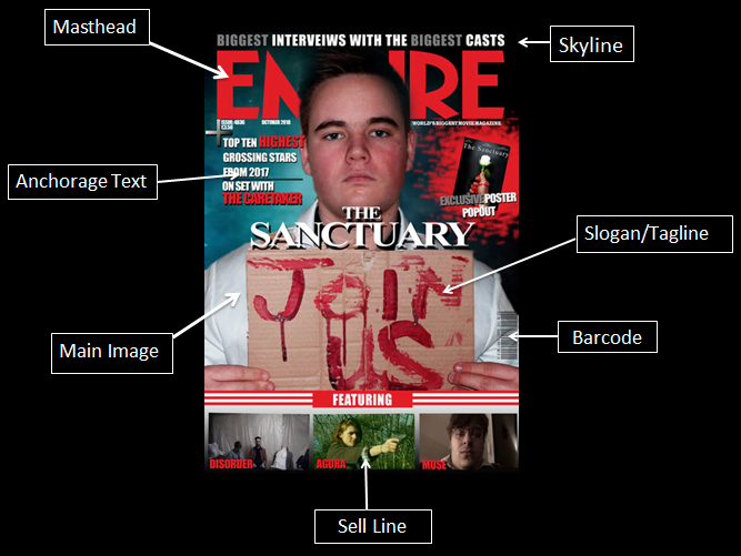
THE MAGAZINE COVER
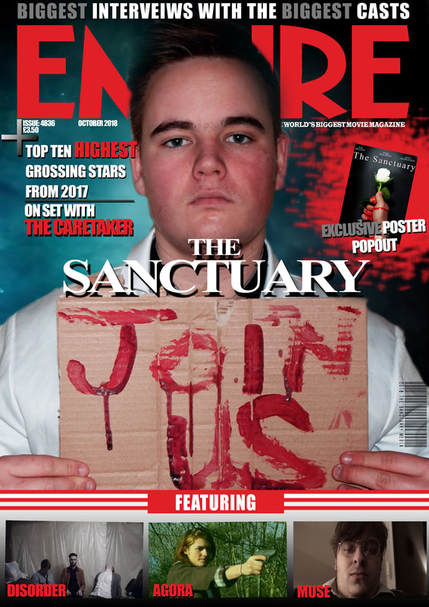
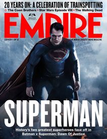
Our magazine cover was crafted using inspiration from other famous Empire magazine covers. Our masthead was the iconic Empire title to create a good looking magazine. As shown in the Superman cover, a figure from the trailer featured in the centre of the magazine gets audiences attention. Our figure was one of The Sanctuary members (portrayed by Josh Baldwin) featured in the trailer, who you later get to know more in the film. We included a colour scheme of black, red and grey as they all work together well. All of our text is the same font as well to for continuity. Other aspects such as the barcode, puff and pugs also all feature to create a realistic piece of work. We deliberately chose to conform to classic magazine conventions because we wanted to ensure that our film would attract the usual readers of Empire magazine; we didn't want break the mold and risk losing sales.
|
|
Annotated Magazine
A magazine is not laid out the way it is by accident, it is intricately designed so that different sections catch the audiences eye in the right way. We have included an annotated copy of our own magazine to show where every element is supposed to be placed.