How effective is the combination of your main product and ancillary texts?
In developing a media product with ancillary texts branding is vital. New media products are developed daily, so it is important for there to be consistency in the branding to make the product identifiable. For branding to be effective the features used have to be distinguishable, this can be achieved through; iconic imagery, font, colour, characters and logo's. Effective branding will increase popularity in the media product.
Iconic Images in Horror
Throughout the history of horror, it is not just the films which have survived throughout the years. It is also the images depicted in those films which have helped shape the genre and the style of films being released today. For example, the Scream franchise have released both films and a successful TV series featuring the infamous Ghostface killer. Not only is his mask recognised across all platforms of cinema and has even branched out into successful merchandise, especially around Halloween. Other examples of this can be found in the Saw franchise with the Jigsaw mask and Hannibal "The Cannibal" Lector's piercing stare behind his restraints and mouth guard.
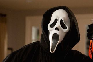
Ghostface-Scream Franchise
|
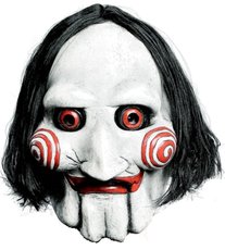
Jigsaw- Saw Franchise
|
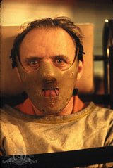
Hannibal Lector-Hannibal Franchise
|
Our Iconic Images
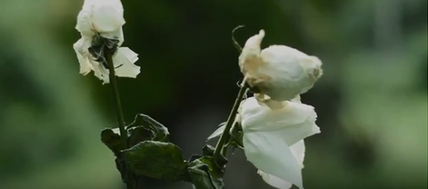
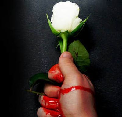
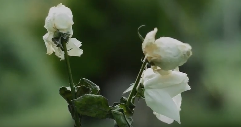
THE WHITE ROSE
The white rose was used across the majority of platforms we used to construct our media and its branding. It features in the trailer between scenes, in our poster as the central image and also in our actual logo. It represents the purity the cult hides behind and was integral during the whole process.
The white rose was used across the majority of platforms we used to construct our media and its branding. It features in the trailer between scenes, in our poster as the central image and also in our actual logo. It represents the purity the cult hides behind and was integral during the whole process.
|
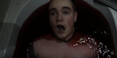
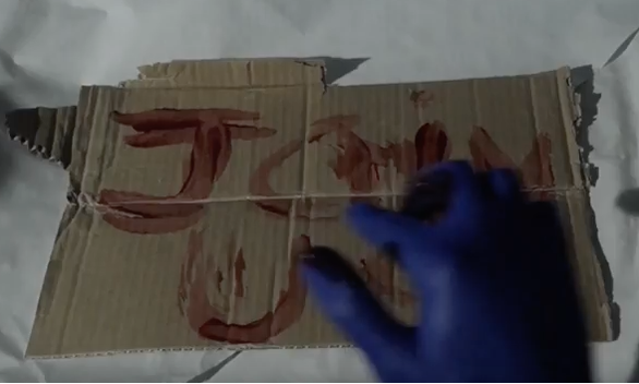
THE BLOODBATH
The bath scene we felt was the most iconic during our filming and editing. It signified the great effort we put into our project based on the dedication of the actor (Josh Baldwin) and how difficult the shots were to film. |
|
ALPHA
|
Iconic Text
As well as having iconic imagery, horror as a genre has also used iconic text which we have come to associate with a certain brand. The style of text used on a magazine, poster or in a trailer can create a lasting effect on its viewers. For example in the Saw franchise, the messy broken font has become synonymous with the brand. Examples of this can also be found in the modern Insidious franchise the iconic Steven Spielberg film Jaws.
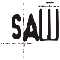
Saw Text
|
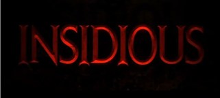
Insidious Text
|

Jaws Text
|
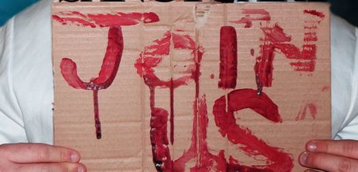
Our Iconic Text
Based on our own work, we wanted to have texts which would have an impact on our audience and work well with our iconic images.
The Magazine Text |
|
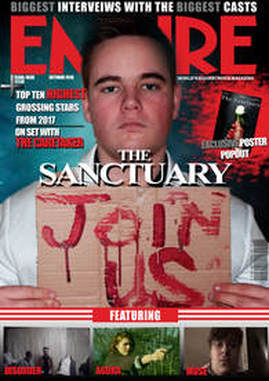
Our Magazine cover's text of the films title "The Sanctuary" was deliberately chosen to look harsher than our text on the poster. We wanted to have two different font types on our magazine and cover to represent the two sides of the group. our magazine depicts the side of the group which we become introduced to later in the trailer. The sharper edges and hard lines around the text represent the groups evil persona.
|
The Poster Text
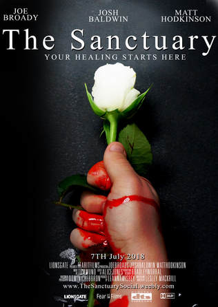
Our poster's title we wanted to oppose what is in the magazine cover. The magazine cover was an incite into what you can expect form the killer cult in the film. Our poster was supposed to be deliberately mysterious. The white rose signifies the groups purity but the blood stained hand indicates their is more to learn about them. Our title therefore needed to reflect the purer side The Sanctuary. we used a thinner, softer text to paint the group in a less harmful light.
Examples
We have included examples of codes and conventions which have featured across our platforms to show the consistency and synergy we have aimed to get across all of media projects.
|
The Poster
|
The Trailer

|
The Magazine
|
